▼
Timeline
◀ HOME
As an Art Director I bring a vision.
I create an attractive look and feel.
Click on the images bellow to learn about the related publication I did as an art director:
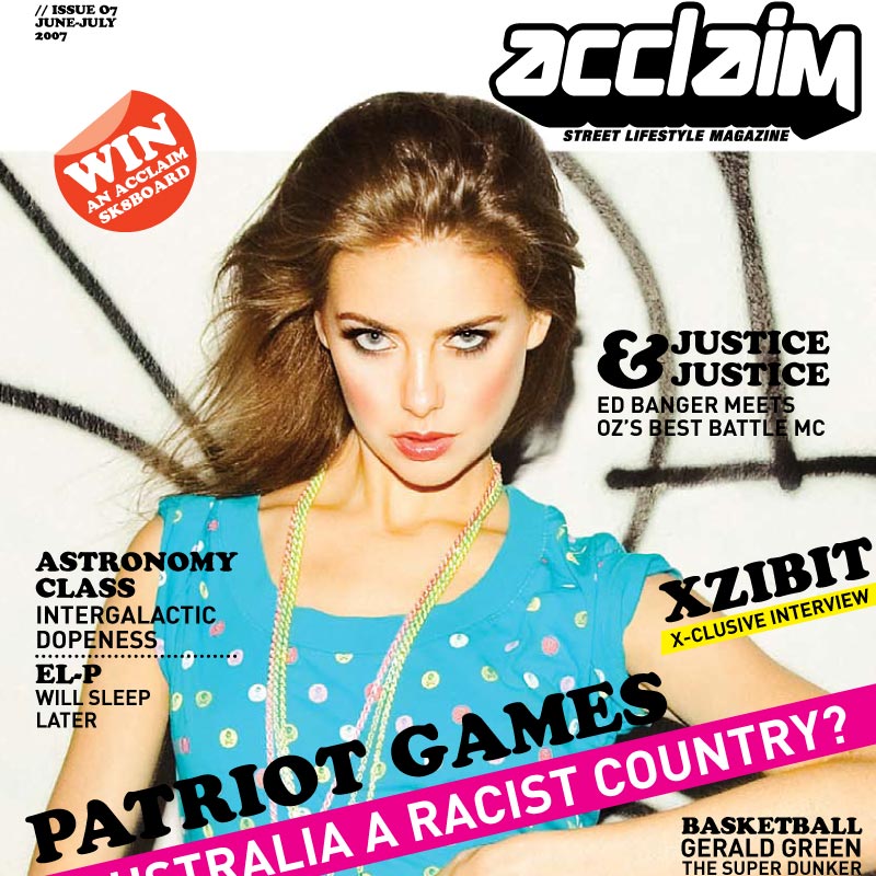
ACCLAIM MAGAZINE
Conception of the new version of lifestyle publication Acclaim.
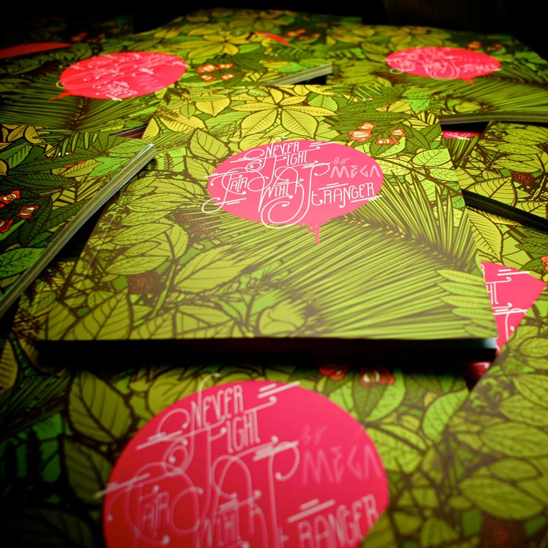
ATTRAPE REVE
Special Mega issue of art publication l’Attrape Reve.
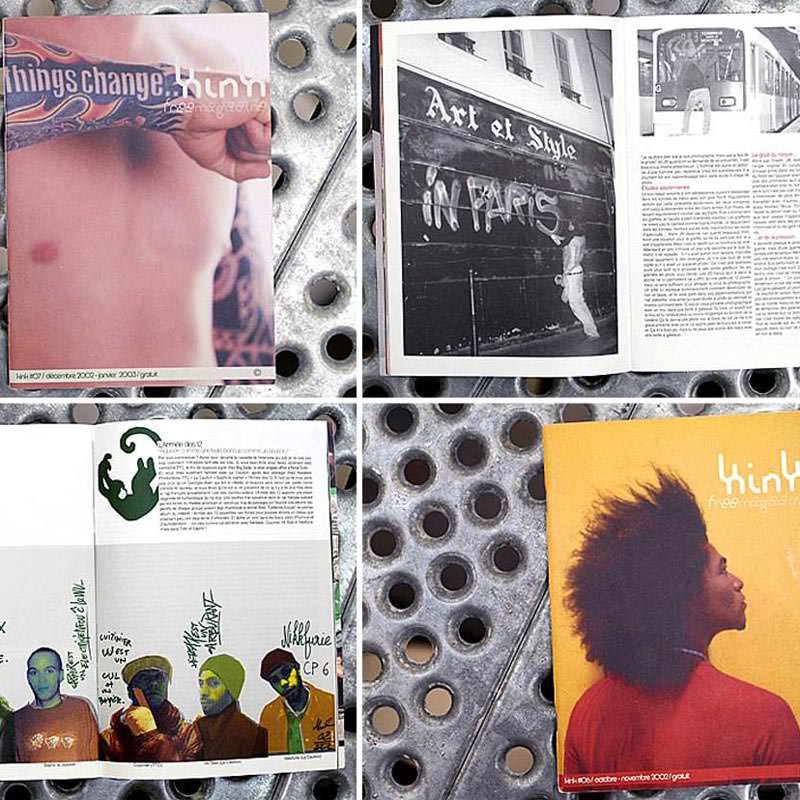
KINK MAGAZINE
Art direction for French urban magazine Kink.
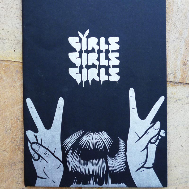
GIRLS GIRLS GIRLS
Independent art publication Girls Girls Girls.
WAD MAGAZINE
Art direction for french fashion magazine WAD.
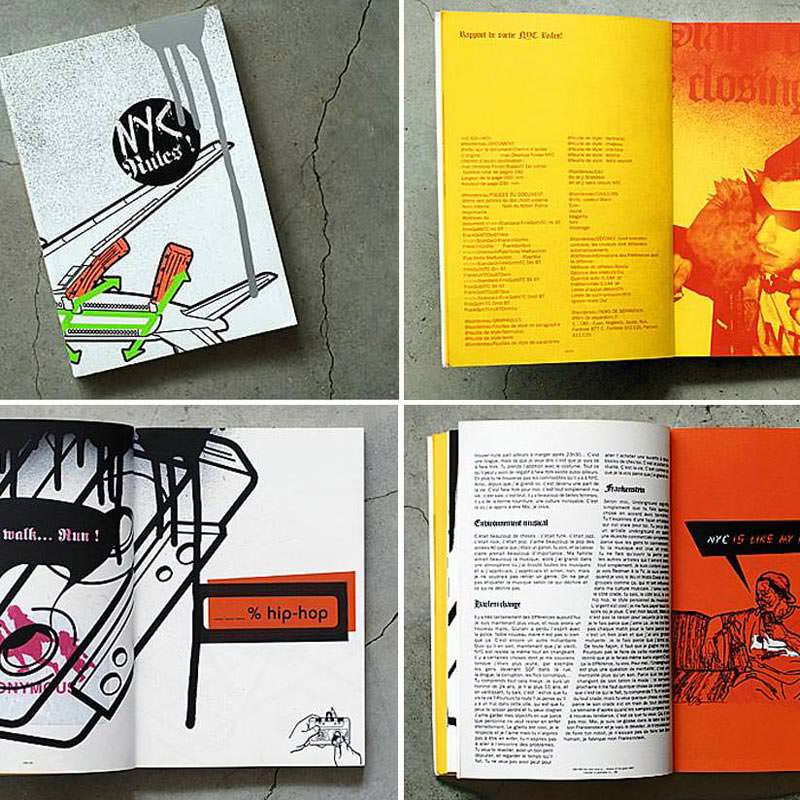
NYC RULES
Conception and publication of graphic design book NYC Rules.
Professional Art Direction.
Since 1999 I work as an art director for “urban culture” magazines and graphic design publications.
I worked as an art director both in Europe and in Asia.
I got 99 problems but design ain’t one.
ART DIRECTION TIMELINE
- FIRST:
I was the art associate and publisher of an independent publication called First.
Independent Graphic publication about international underground music. - KINK MAGAZINE:
I then became the creative director of Kink.
Urban cultures and art magazine. - NYC RULES!
Later I directed and published a book called NYC Rules!
Unique graphic design book about New York City progressive cultures. - BPM:
Before I knew it, I became the art director for the major french publication called BPM.
Street culture and music magazine. - WAD MAGAZINE:
WAD magazine then asked me to become their art associate.
International reference for urban (life)style and fashion cultures. - ACCLAIM MAGAZINE:
I flew to Australia where Acclaim magazine wanted me to work on their art direction.
Leading Australian & New Zealander lifestyle magazine. - GIRLS GIRLS GIRLS:
Art director and publisher of Girls Girls Girls.
Nice and small art publication. - ATR:
Never Fight Fair With A Stranger is an art publication I directed for a special issue.
Art publication by l’Attrape Reve.
YOUR PUBLICATION
I can do the art direction for your project.
Do you need a dynamic feel for your printed material? Do you want to improve the look of an existing publication?
Drop me an email to tell me more about your graphic needs.
8
international publications
ART DIRECTION EXPERIENCE
More info about my journey as an art director.
My love for good design and creative layouts started when I was a kid.
I spent days cutting magazines and pasting new layouts to create covers for my music tapes. I wanted my recorded tapes to look sleek and cool like the original ones.
As a teenager I painted the walls of my city and the trains of my region. I also spent a lot of time on my computer to learn how to use softwares.
A small magazine in my home town saw my work and asked me to become their art director. I was 19 and I took the job.
During my early years in the design industry, I worked for urban and fashion magazines in Europe. Later I moved to Sydney to re-think the creative direction of what became the most successful urban magazine in Australia.
MY LOVE FOR ART DIRECTION
I enjoy the constraints of printed publications.
You have to create a cutting-edge vision and follow the briefs from your editor-in-chief.
You need to manage a team of illustrators, graphic designers and photographers.
Everybody needs to be efficient and to work hard.
Nobody blames you for drinking too much coffee…
I’m just a tidy badass.
You need to master all printing techniques when you work in art direction:
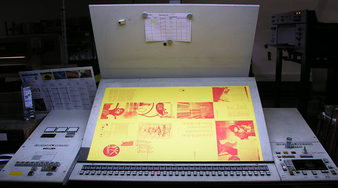
For a couple of year I was the art associate for WAD magazine in Paris. The mag is one of the international leading publication about urban fashion and culture.
MORE ABOUT WAD MAGAZINE →
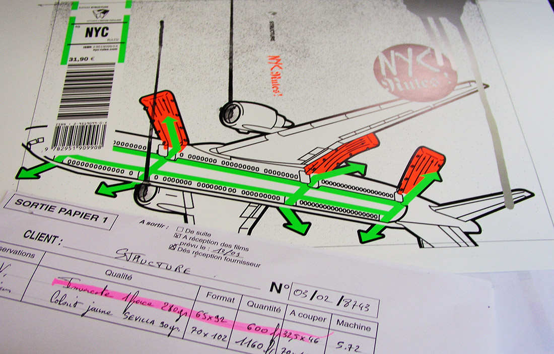
Take a look at my first graphic design book. I designed, wrote, directed and published this book in collaboration with graphic designer Delarocca. The publication took an innovative approach on New York City underground cultures.
MORE ABOUT NYC RULES →
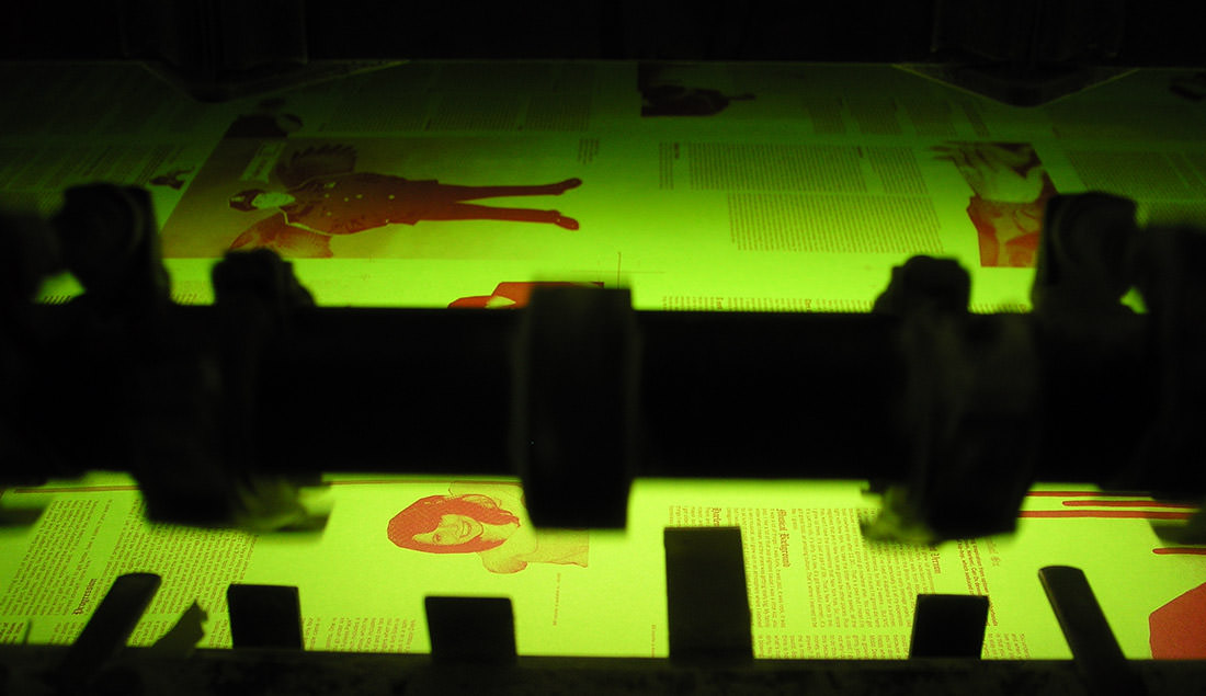
Acclaim hired me to come to Australia and work on a new version of their magazine. I created a new art direction, and alongside the editor Pierre Henny we brought the magazine to a new direction, and opened it to a wider audience.
MORE ABOUT ACCLAIM MAGAZINE →
12
essential tips
12 TIPS TO BECOME A SUCCESSFUL ART DIRECTOR
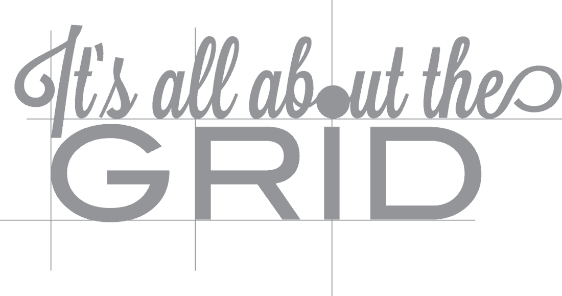
When it comes to art direction you need a great understanding of design principles and a strong knowledge of grid systems and layout. You also need a creative approach of color treatments. But you need more than technical knowledge. You have to bring a soul and a unique vibe to the publication.
Let me explain you what it means (for me) to be an art director:
-
SEE THE BIG PICTURE | Build the general look and feel of the publication:
- DEFINE a general look relevant for the intended target.
It can be minimalist, something focussed on the typography, etc.
Do what you feel but stay consistent throughout all the pages.
As a good art director, we expect you to give a true identity to your magazine. - My first book NYC Rules! dealt with New York’s underground cultures. The book was a visual translation of the urban feeling I had when I was in the US.
- ORGANIZE the content with the editor:
Never work alone.
That’s a mistake a lot of beginners do. They spend days to work an an awesome layout but the editor doesn’t like it.
You have to work closely with the editor-in-chief. Simply put, your job is to make his texts look cool.
You have to understand the message he wants to carry. - DESIGN the layout with a clear visual organization.
Don’t go too far.
A good art direction is one nobody would notice.
You work is to make the content attractive. It is not to distract people with fancy graphic design.
There is no virtue in being fancy. The only virtue a good art direction has is in being useful. - In 2007 I became the art director of Acclaim in Australia. The publication was a street fanzine turned into a hip hop magazine. The graphic design was over the top and full of stereotypes. I work on a new layout with a clear and clean organization. Talking about urban lifestyle doesn’t means that you have to do a messy layout.
- DEFINE a general look relevant for the intended target.
-
MANAGE YOUR TEAM | Work with top-notch illustrators and photographers.
- SOURCE the most relevant visual artists to illustrate the articles.
Submit your ideas to the editor.
Do you think that a photography portrait would be relevant to illustrate this article?
Contact the best photographer your magazine can afford.
Please respect the artists and their works. Don’t call a macro photographer if you need pictures of a racing competition. - Give them a relevant BRIEF:
If you want to have good results, you have to give clear directions.
You can’t expect an illustrator to draw something relevant if he doesn’t understand what you want.
A good brief is a detailed brief. Don’t say things like: “do something cool”. Something might be “cool” for the artist but irrelevant for the article. - FOLLOW-UP so everybody respects the deadline.
Keep in mind that you have to work in a time frame.
Some visual artists will not respect the deadline unless you call and email them every two days.
You don’t need to get angry. It is part of your job. - When I was in charge of the visual direction of BPM I struggled to get quality photographs and great illustrations with a limited budget.
- SOURCE the most relevant visual artists to illustrate the articles.
-
SPICE IT UP! | Care about the details.
- DIVIDE the content:
Bring innovative concepts to mark the different sections.
Make a creative use of colors, fonts, or icons.
People should be able to open the publication at any page and quickly understand what the section is dealing with. - CREATE nice icons to mark-up the sections.
Once again, don’t go too far but some discreet icons or special typography can help you organize the content. - WAD had 3 main sections. We presented fashion products in the first part and photo shoots in the second. In the last section we introduced creative brands. The structure was really clear, which is important when you work on a 300 pages publication.
- ADD small tables and graphics:
People love charts.
It visually translates the article.
Good diagrams should be easy to understand.
- DIVIDE the content:
-
STAY INFORMED | Know the content:
- TALK WITH the editor-in-chief.
You are not a good art director if you don’t what your publication is talking about.
The editor-in-chief organizes the written content.
Contact him to fully understand what the articles deal with. Don’t hesitate to ask him about his own ideas.
Find as much as you can about every topic. - CONTACT the journalists after the interviews.
Ask them what happened, how was the general mood, did the people they interviewed mentioned anything special?
Sometimes the people you interview (or their agent) give you great pictures.
It can make your job easier but ask the agent for the exclusivity.
You don’t want other magazines to publish the same pictures.
- TALK WITH the editor-in-chief.
I hope that you enjoyed these simple tips to become a good art director. I based the advises on my 14 years of experience in the publishing industry. Of course you can do an awesome job by following your own rules.
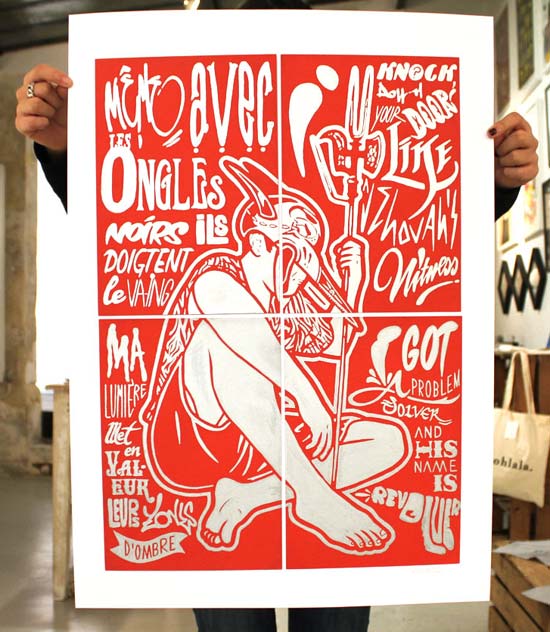
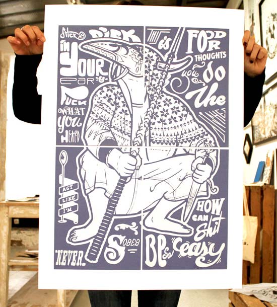
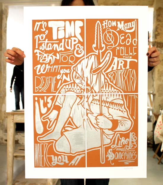
To see some of the drawings I’ve done for magazines and books, check my illustrations.
