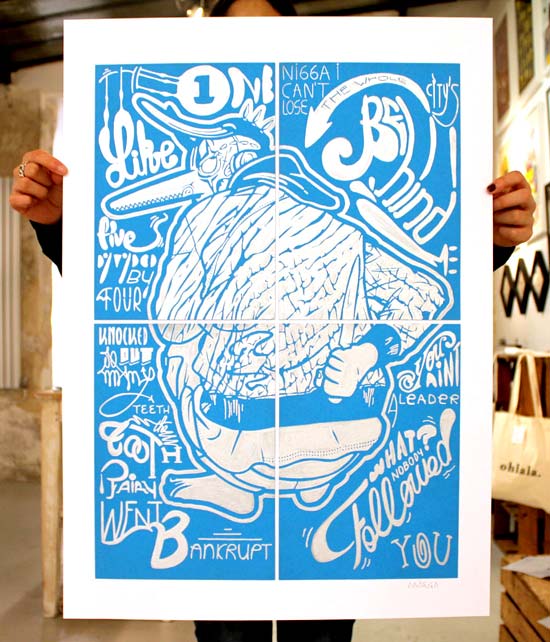
▼
Publications
◀ HOME
I’m obsessed with sleek curves.
I’m bewitched by the depth of solid colors.
Click on any of the illustrations bellow to see more drawings from the category:

ADVERTISING
Advertising for Volkswagen.
Drawing of the new Tiguan model.

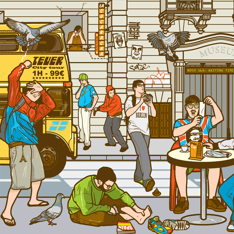
CHARACTERS
Characters design.
Artworks for Complex magazine in USA.
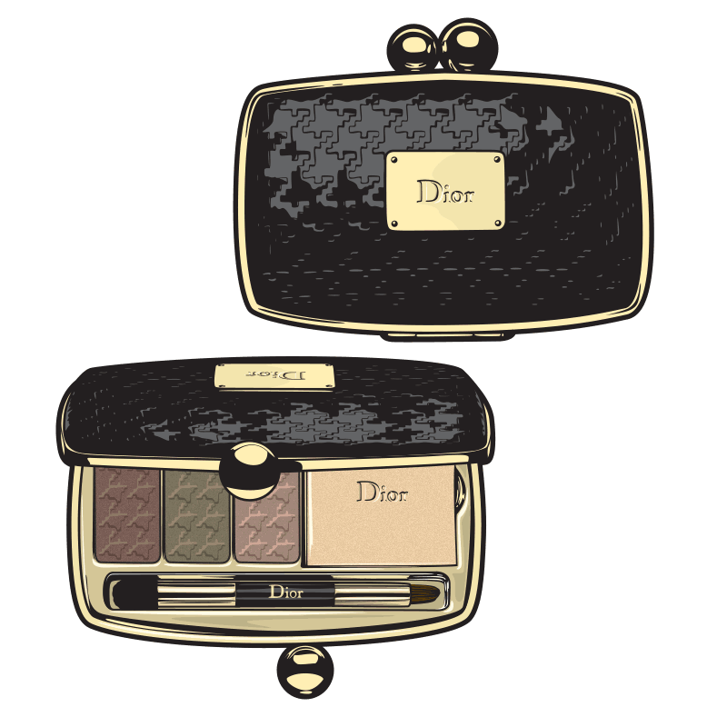


LUXURY WATCHES
Drawings of luxury timepieces.
Selection of the best watch brands.
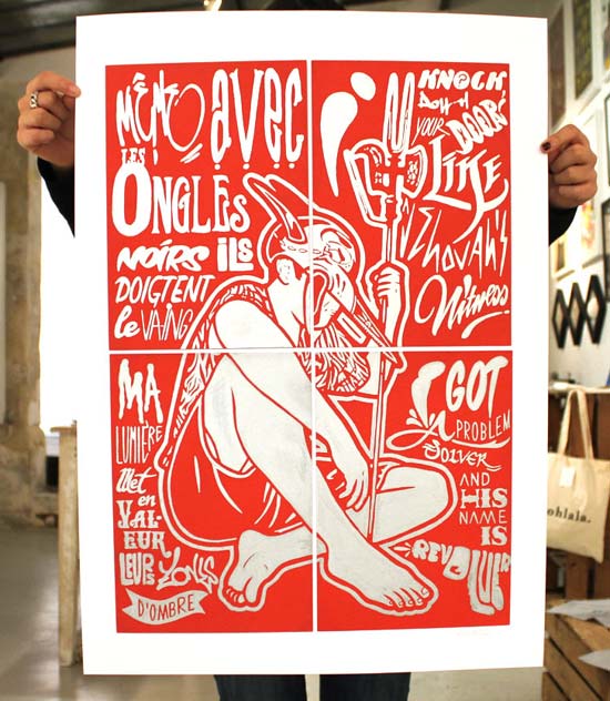
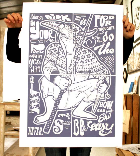
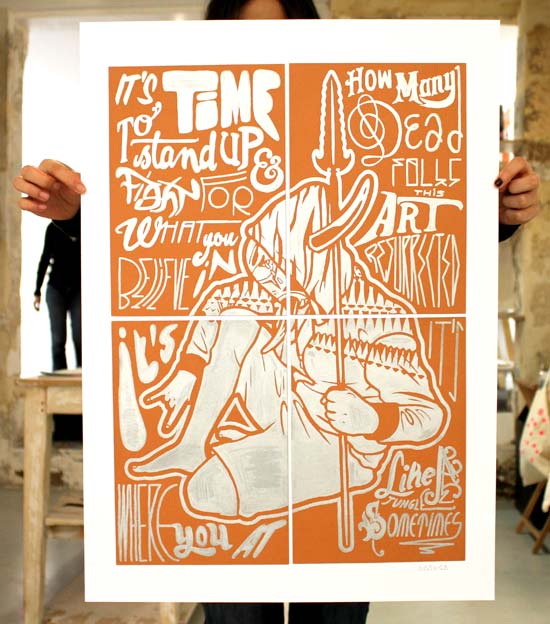
Drawings With Attitude
Check my illustrations for magazines, advertising, and graphic design books.
My motto is simple:
Love what you do and you will do it well.
of magazines and advertising
ILLUSTRATION EXPERIENCE
I’m here to kick ass and chew gum and guess what? I’m all out of gum.
I see art as a something serious I can play with, trying combinations that give depth to my drawings.
Throughout the years, I have worked for magazines like Complex magazine in the USA, Mens Health in Germany or prestigious publications in around the world.
My dreams are CMYK.
I previously worked as an art director. I know how important it is to respect the deadline and stick with the brief.
I worked on several advertising campaigns. I worked for clients like Volkswagen, the French government, or European supermarkets. In advertising briefs are precise and deadlines are short. This is good. I love to work with people who know what they want. It is easier for me to provide what they need.
ILLUSTRATIONS FOR YOU.
Add vibrant colors to your life.
Do you need an illustration for your magazine, album cover, advertising, or book? Let’s talk about your graphic needs.
GRAPHIC SKILLS
People ask me what software I use for my illustrations.
I use the Adobe® Creative Suite. Vector drawings are lightweight and flexible, so I can send detailed illustrations as simple email attachments.
Easy…
Look at the graphic bellow to visualize my command of the Adobe® Creative Suite softwares:
Overall, I inject an urban flavor into tasteful creations.
Discover examples of my illustration work for publications and brands:

Take a look at some of the illustrations I have done for brands to promote their services or products. I like to work with advertising agencies because the briefs are very clear.
MORE ADVERTISINGS →

I love 20th century furniture and home accessories and I love illustration. Made sense for me to draw a series of furniture illustration. From Danish cabinets to Italian dining tables to Swedish lamps, discover the vintage furniture I love the most.
MORE FURNITURE ILLUSTRATION →

Lifestyle magazines and fashion publications ask me to draw characters. They use my characters to give a catchy feel or a special touch to an article. Mens Health commissioned this particular illustration for the German edition of their magazine.
MORE CHARACTER DESIGN →
SELECTED PUBLICATIONS
Here is a selection of publications with commissioned illustrations and articles about my work.
Move over the magazine names bellow for more information:
For over 3 years, I contributed with a FULL PAGE in each issue of this cross-cultural magazine.
Freshly picked among a collection of today’s hottest illustrators.
Magazine COVER and main article on 12 pages.
This collection of art has SELECTED me to create a visual alongside Tim Biskup or Jon Burgerman.
Selected among some of the finest visual artists of today’s ILLUSTRATION.
Magazine COVER and artwork showcase for the 16th issue.
I was the main ARTIST of the issue.
Magazine COVER plus a ten pages interview.

6
crucial tips
TIPS TO BECOME A KICK-ASS ILLUSTRATOR
Sometimes people ask me how they can become an illustrator.
Other don’t seem to even understand what I do for a living.
Here is a series of simple tips to start your career as a professional illustrator.
-
BE PASSIONATE:
You don’t need to go to an art school to become a successful artist.
All you have to do is to practice a lot. Freelance illustration is a lifestyle and not a career move. Work hard and be ready. Commissioned works are unpredictable and you will go through his and lows.
You don’t know how to draw?
Do it all day long for a couple of years and you will become amazing. Practice a lot. Build a unique style that people will hire you for. - I went to an art school but I didn’t learn anything there. I dropped out of school and locked myself in a room to work on my illustrations. After a while I started to get my first jobs.
-
BE UNIQUE:
Having a unique and consistent style is the most important key to become a successful illustrator.
Many young artists mistakenly think that they can adapt to any style.
While you have to follow the client’s brief and stay flexible, your style is the reason they hire you in the first place.
Art directors want to work with you because your style fits their needs. - Art directors look for illustrators they like. One guy can do colorful and naïve doodles while another is really good at detailed illustration. They would rather work with someone who is really good at one thing than someone who is average at two.
-
BUILD YOUR PORTFOLIO:
It’s all about the image.
You can’t expect people to take you seriously as a visual artist if you can’t present your work properly.
You need to create an attractive online portfolio with a selection of your best works.
You also need to have a physical portfolio.
Print 10 big versions of your best images on quality paper. Wrap it in quality leather and be ready to show it to prestigious advertising agencies. -
BE A PROFESSIONAL:
Respect the deadline.
Make sure to deliver your illustrations on time. Be nice and communicate regularly with your client.
If you want to make a living from your art, you have to prove that you can respect the briefs and the deadline. -
PROMOTE YOUR WORK:
Let the world know about your latest works.
Maintain a network of contact and send them a newsletter with your recent work.
Publish your best material online and share it on the social networks.
Be careful not to go too far. Good illustrations speak for themselves and you don’t need to hype yourself too much. -
DON’T WORK FOR FREE:
“It will look good in your portfolio”.
Many people will ask you to work for free.
Working for free devaluate yourself and the industry. You have to pay your bills and eat. - On social networks, strangers contact you for a (free) illustration for the cousin’s wedding.
In the real world this “friend of a friend” will ask for a free t-shirt design for his future clothing brand.
Ask for free banknotes.
Not everyone can become a good illustrator. It is a lifestyle more than a job and you need graft, persistence and organization.
I hope that the simple tips above will help you understand what it takes.
ILLUSTRATION PROFILE
Better than talking about my art, let’s hear what professionals from the design industry have to say:
“MEGA CONTROLS HIS STYLE in this way creating slick and justified work that is skilled not only mechanically but works as an illustrator should by selling the message hard. This can be down to his street roots or more likely honed by editorial experience, either way he can put a point across with a tropical sense of glee and a palette rich with street colour.
A true talent, it’s Mega.”
by GRAPHICART NEWS.
Check my illustrations for brands and products.
