Jesse Fillingham loves burgers, mythology… and unicorns.
He also graduated with honors from Art Center College of Design in Pasadena with a BFA in Illustration.
He did a lot of shows in California since then. More about the US artist Jesse Fillingham.
Jesse Fillingham artwork
PLEASE INTRODUCE YOURSELF
My name is Jesse Fillingham. I was born and raised in San Diego, California, I now reside in Pasadena, California. I graduated from Art Center College of Design in 2010. I enjoy drawing, comics, bound media, zines, burgers, beer, and unicorns.
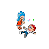
Jesse Fillingham Fatalist Palmistry
HOW WOULD YOU DESCRIBE YOUR WORK?
Two things that seem to be present in a lot of my work is an emphasis on nature/natural phenomena and mythology/fantasy. Rendering is also a process that I put myself through in most of my work, which I find to be extremely rewarding.
Jesse Fillingham Limit Break
PLEASE SHARE WITH US YOUR WORKING PROCESS
It varies quite a bit depending on the application of the image. I generally make a sketch of some sort figuring out the main components of the piece I am working on. That sketch either gets blown up and traced or I re-draw it to scale. Then a variety of media is thrown around until I am happy with the image.
Jesse Fillingham Miner
HOW DOES YOUR ENVIRONMENT INFLUENCE YOUR ART?
I couldn’t really say, I have lived in Southern California my whole life so I guess it would be interesting to see if there was a change in my work living in a different part of the country/world.
But in terms of my work space, my roommate James Chong, and I don’t have a living room because we turned it into our studio, which makes for a great working environment.
Jesse Fillingham Tree Spirit
WHO ARE YOUR INFLUENCES?
John James Audubon, Kuniyoshi, C.F., Stanley Kubrick, Tadanori Yokoo, and a host of amazing artists on my favorite website: flickr.
ANY LAST WORD?
Check out Never Press! It is a small press that two of my friends and I started. We are producing zines and comics and all kinds of eyegasm-inducing products!
Mateo takes snapshots of a parallel universe.
He is also an handsome artist. Learn that and more in this nice interview. More about Mateo.
Mateo Dineen inbread drawing
PLEASE INTRODUCE YOURSELF
If you don’t already know me, I can tell you that I am extremely handsome and charming. However if you DO know me, please don’t tell the others otherwise.
I am an artist living and working in Berlin. I grew up in California, near San Francisco.
Here are some random things about me:
I carry a pen and a stack of small notecards wherever I go.
I don’t like mornings.
I once had a job making balloon animals.
I used to catch tadpoles and watch them grow legs.
I love antique shops.
My middle name is NOT Mud.
Mateo Dineen painting
HOW WOULD YOU DESCRIBE YOUR WORK?
Snapshots from a parallel universe. That pretty well captures what it’s about. It’s everyday moments in a world very similar to our own, with characters oddly familiar. They have the same emotions and problems we have, but they are often rather furry, or made of metal.
Mateo Dineen monster character
PLEASE SHARE WITH US YOUR WORKING PROCESS
For me it all begins with a sketch. Sometimes it’s a doodle drawn without much direction. Other times it’s a constructed drawing coming from a direct idea. I have pages and pages of these drawings. Before I begin a painting, I usually flip through my stack of drawing and try to feel a connection to one of them. It needs to make me laugh or feel something, as if I’ve seen it for the first time. If it does, then I know it’s probably an image that others will connect to as well. I then dig through my collection of old boxes and wooden desk drawers. I look for the piece that connects best with the sketch. Once I’ve chosen the piece of wood, I often cover it with collage and do my best to enhance whatever patina the wood already has. Lastly I bring the main figure elements in and marry it all together into the final painting.
Mateo Dineen surreal art
HOW DOES YOUR ENVIRONMENT INFLUENCE YOUR ART?
My environment plays a big role in my work. If you see my work up close, you’ll see that I’m never painting on fresh canvas. My paintings are made on worn-out box lids, wooden suitcases, and rusty tin signs (to name a few examples). These objects come directly from flea markets here in Berlin. These old relics are very inspiring to me. The collage I use for the background is collected from flea markets too. I’m often entranced by the discarded letters, blueprints, and maps that I find. They tell a story of another time. These items enrich my work, and sometimes inform it.
Mateo Dineen artwork
WHO ARE YOUR INFLUENCES?
I have many. Here are few in order of appearance…Van Gogh, N.C. Wyeth, Ray Harryhausen, Edward Gorey, Dr. Seuss, Shel Silverstein, The Muppets, Bugs Bunny, Star Wars, Tim Burton, Brad Holland, Peter De Sève, Joe Sorren, Mark Ryden, Jeff Soto. The list goes on.
ANY LAST WORD?
I think it is important to point out that the creative process is what brings me the most satisfaction. By that I mean to say that the end result is not the primary goal. The finished painting is just the evidence of creation. The main goal is the act of creation itself. It is these moments of creation that I yearn for. I love to lose myself in the process. It’s like magic.
A four pages article for the ‘Red’ issue of WAD magazine.
The great photographer Estevan Oriol liked it and gave me some of his photo to illustrate it!
Learn more about the history of gang culture in the USA.
Do you know how the battle between the Crips and The Bloods first started?
We could hardly deal with the theme of ‘Red’ in urban culture without going to Los Angeles. It may be the City of Angels and all possibilities, but Los Angeles is also the cradle of gang culture and bloody shoot-outs. You know the cliché: the Bloods dressed in red protect their neighbourhood and head off around town to find some Crips to gun down. But behind the bandanas and clinking bling-bling hides a social phenomenon that finds its origins in the very roots of American culture.
HOW DID THE GANG CULTURE START?
“NIGGA QUIT LYIN’, YOU’S A NIGGA FOR LIFE” – SNOOP DOGG
The story began in the 1920s when less than scrupulous landlords invented racial restrictions aimed at stopping African-Americans from living in Los Angeles’ traditionally white neighbourhoods. With the help of some reactionary laws, the landlords stopped all possibility of different communities mixing, and contributed to the reinforcement of a ghetto feeling among the population. Over the years, this segregation established until, by the 1940s, it was a social reality. Racial conflict grew at the same speed as the growth of the ghettos on the east of the city and with more and more people arriving, the neighbourhoods (whose geographic limits were strictly contained) were soon overcrowded. Despite this, the white community continued its firm, overtly racist stance on territorial claims and continued its opposition to the creation of new mixed-race neighbourhoods. The feelings of hate and fear grew to the point that the Ku Klux Klan, which had all but disappeared 20 years earlier, was reborn. Some of the young white population banded together to create “street groups”, small groups whose stated aim was to fight any attempt at integration. Spook Hunters, for example, was a genuine neo-fascist militia beating up blacks who dared to adventure out beyond the perimeters of their allotted urban space. In reaction to this persecution, the first black street groups appeared with names like Devil Hunters, dedicated to protecting themselves from attacks. As black groups sprang up, the white population gradually began to leave the centre of the city, attracted by the expansion of the new suburbs. The neighbourhoods of Watts, Central Avenue and West Adams emptied out and became the cradle of new African-American gangs.
The 1960s saw the first black-on-black conflict. Black groups from different parts of Los Angeles began to face each other down under the cover of claims to different territory. The brawls between eastern and western neighbourhoods became common; the fights were mainly hand-to-hand (even if knives were used occasionally) and murders were rare. The main aim was each neighbourhood gang’s desire to prove to the other group the supremacy of its neighbourhood, while winning the respect of the old-timers.
POLICE ABUSES:
“I BRING CHAOS TO BLOCKS LIKE THE RIOTS IN WATTS” – METHOD MAN
Overcrowding wasn’t the only reason for the overriding feelings of distress. The misery of daily life was added to by an oppressive police presence. Police brutality insidiously reinforced the social pressure and feelings of persecution already growing within the population. The tension was already at a peak when in 1965 the violent arrest of a black driver lit the touch paper… and Watts exploded. The ensuing rebellion and series of violent riots lasted a week, with around 10,000 people taking part in the protest movement. The police were only able to restore order after 34 people had been killed and over 1,000 wounded. Yet it was in the ashes of this social upheaval that the consciences of a people in crisis were awoken. Influenced by the ideology of the Black Panthers and the US Organization, street gangs became radically politicized. The initial aim of the gangs, which over time had become blurred, was brought sharply back into focus through the spreading neo-Marxist message of Black Nationalist militants. Up until that moment, the battle had been a physical one (a defence of the neighbourhood from attack), but post-Watts it became a political battle to defend the neighbourhoods from the attempts at government subjugation. When black extremist organizations threatened to become some of the most important socio-political forces in the country, the police and the government began its attempts to thwart their irresistible rise. The powers-that-be created new paramilitary units (SWAT teams) to combat more efficiently any risk of future riots. The head of the FBI, J. Edgar Hoover ordered his agents to try all possible methods to create splits between the different parties. The FBI and CIA reproduced the plan dreamed up to fight Communism: set up a propaganda campaign portraying the political movement as ‘dangerous’ for the general population. This witch-hunt kindled divisions between the Black Panthers and the US Organization, the two main parties. By the early 1970s, the murder of one of the leaders of the Black Panthers, blamed by the police on the US Organization, can be seen as the beginning of the end of black political groups’ influence in Los Angeles.
Photo by Estevan Oriol
BABY CRIBS & PIRU STREET BOYS:
“I SEE BLOODS AND CRIPS RUNNIN’ UP THE HILL” – 2PAC
The end of the 1960s saw the arrival of a new generation, one that had witnessed the height of the Black Panthers’ power and then watched in silence as it agonisingly collapsed. A whole generation marked by people they saw as social role models. They may have been too young to have taken in the political message, but they remained heavily influenced by the movement’s spirit of protest and fascinated by the party’s dress codes. And it was this attraction to the Panthers’ famous black leather jackets that was at the origin of the creation of the biggest gang in history. In 1969, Raymond Washington, a 15-year-old school kid, gathered together a few of his neighbourhood friends and founded the Baby Avenues, also known as the Baby Cribs. The gang’s original idea was to keep the revolutionary message alive and to protect the neighbourhood’s residents, but their interest quickly turned to more illicit activities. A look was central to the group and its identification with the Black Panthers pushed the members to sport black leather jackets. The gang dedicated itself to looking out for the famous jackets, attacking anyone wearing one and then stealing it. These attacks marked a turning point in Los Angeles’ criminal history when gangs went from fighting themselves to attacking the general population. The media were quick to jump on the gang’s criminal activities, in the process creating a certain aura that had an impact on the city’s young population. There has never been a clear explanation of the Crips name but one is that a local newspaper’s wrote Crips instead of Cribs and the typo stuck. Whatever the reason, from 1972 the gang became known as the Crips. The gang’s image was developed and honed. Between robberies and break-ins, the members paraded around in their jackets, carrying walking sticks and wearing earrings in their right ears. The ‘uniform’, aimed at bringing together the increasing membership, was then borrowed by various political/Mafia-like gangs in Chicago (such as the Disciples and Folk Nation). The increasing violence continued and it didn’t take long for the first murder to be committed: a 16 year old beaten to death for his leather jacket. The media coverage of the event did nothing to dissuade people from joining the Crips or creating their own gang. The phenomenon spread like wildfire, giving a population that had so often been marginalized a way of taking centre stage and finding an identity. At the end of 1972, there were more than 20 gangs and no fewer than 30 murders had been attributed to them. Due to their numerical superiority, the Crips terrorized the other gangs without fear of retribution. The Piru Street Boys decided to unite a number of gangs to create a solid anti-Crips union and protect themselves from the constant intimidation. The Bloods was born and the battle could begin.
CRIPS VERSUS BLOODS:
“GO BACK IN THE DAY, BRITISH KNIGHTS AND GOLD CHAINS” – MISSY ELLIOT
As time went by, the clothing rules of the two sides were established. They allowed the two gangs to affirm their unity and played a major role in the construction of their identity. In opposition to the Crips, who adopted the colour blue and wore their accessories on their right side, the Bloods dressed in red and wore their earrings and jewellery on the left. In prison, where uniforms made colour recognition impossible, members pulled up the trouser leg on the side that matched their gang affiliation. This practice was adopted in the street and even took in baseball caps (the peak was either worn turned to the left or right). The English brand British Knights saw its sales figures explode when the Crips decided to adopt its shoes, less for their looks than the significance of the logo: BK suddenly stood for Blood Killers. The Bloods responded by choosing Calvin Klein with the CK logo standing for Crips Killers. Affiliated with Chicago’s Muslim-influenced Almighty Black P. Stone Nation, the Bloods kept that group’s religious imagery and used the five-pointed star of Islam as their emblem. Over time, the red and blue colours were integrated into the tiniest details: bracelets, fat laces, socks, belts, rings, badges, bandannas, and so on. Some members even went as far as dying the inside of their pockets, which could be easily hidden should the police roll up. The two sides also wore Dickies and Ben Davis khakis, as well as flannel Pendleton shirts.
GANG CULTURE TODAY:
“GANGSTA, GANGSTA! THAT’S WHAT THEY’RE YELLIN'” – NWA
The foundations for modern gangs were laid in the 1980s. As an omen of the escalating violence that was soon to arrive, Raymond Washington, the Crips’ founder, was assassinated in 1979. From that moment on, no fight between the gangs could be settled without a bloody shoot-out. Gang territory moved out of its original inner-city ghettos, first across Los Angeles, then into many of the US’s larger cities. The savagery also grew exponentially and between 1980 and 1995, Los Angeles saw the creation of 150 new gangs, for the most part affiliated with either the Bloods or the Crips. The epidemic continues to spread to this day, reinforced by the catalysts of a number of cultural and social phenomena. Over the last 25 years, unemployment has continued to rise, generating in an already fragilized population a sense of bitterness and despair that sees no possible way out of its lack of prospects. In a more insidious way, cinema and music have contributed to spread the movement’s seductive image. The success in the early 1990s of gangsta rap and films such as ‘Boyz n the Hood’ and ‘Menace II Society’ (even if these films are far from rallying calls to the gangs) contributed to the popularization of the image of the gangsta in American society.
Today, the situation seems to be delicately balanced. With 400 gangs and around 50,000 members, the future of Los Angeles could be bloody. For the moment, while the number of gang members continues to rise, the murder rate has stabilized. The gangs’ aspirations for revolutionary change seem to have been definitively consigned to the past and it can be seen as a shame that the ghetto imagery has too often overshadowed political ideals. The gangsta has become a representation of a spectacular side of American folklore. The gangsta is now an icon, but one whose image is more useful in oiling the wheels of capitalism than fighting the problems of segregation and poverty that brought it into existence in the first place.
A lil’ interview with the godfathers of pixel, I mean of course the artists trio eBoy.
Undisputed sovereigns of pixel art, The graphic collective Eboy has developed throughout the years a sophisticated artwork where you can see rampaging robots climbing big buildings next to tanned bikini girls, all of it in a complex and fun looking 3D world. With their shiny style, Steffen Sauerteig, Svend Smital and kai Vermehr have quickly earned worldwide recognition, and caught the eye of companies as big as MTV, Honda, or Coca-Cola. Kai brings us beyond the screen and explains to ACCLAIM how Eboy became one of today’s finest art crews. More about Acclaim magazine.
More about the godfathers of pixel.
Pixel drawing of Berlin
LET’S GO BACK TO THE EARLY DAYS. HOW DID YOU ALL MEET?
Svend and Steffen knew each other for a long time. I met Steffen at MetaDesign around 1996. After we left there we started gaming together. Soon we decided to start a website with fun pixel stuff on it and registered eBoy.com. Soon Svend joined and from there it just evolved.
WHAT IS THE INFLUENCE OF THE INTERNET ON YOUR WORK?
At the beginning we only wanted to work for the screen. We were not using the internet yet. All the stuff was distributed on diskettes on a viral basis. But as soon we got connected it was obvious that our work for the screen was perfect for the internet playground. So from there on we focused on it as our main medium.
We also use the internet extensively as a communication and research tool between us. We use txt, audio and video chat, flickr, etc. etc. So it is just everywhere.
WHAT’S THE BIGGEST DIFFICULTY IN USING PIXELS AS A DESIGN TECHNIQUE?
I’d say it’s restriction to a square which makes organic shapes difficult. But this difficulty is what makes this technique so much fun to work with. It makes you work hard but guides you to a level of abstraction that we enjoy very much.
WHERE DOES YOUR OBSESSION WITH BIG CITIES COME FROM?
Well, it’s the place where life condenses and we do probably prefer to live – it’s where we actually are. But there are many cool places, it does not have to be a city probably…
Flying Taiwan Dragon artwork
WAS THE BERLIN ENVIRONMENT AN INFLUENCE IN THIS CHOICE?
Only because we live here and that influences us. We love Berlin, it’s a city of change and electric energy with many many faces. It’s something you sure see in our work.
iPad cool design case
WITH INTERNATIONAL RECOGNITION FROM THE DESIGN COMMUNITY, AND AN ENDLESS LIST OF MAJOR CLIENTS FROM NIKE TO COCA-COLA, WHAT KIND OF CHALLENGES STILL KEEP YOU MOTIVATED?
We are currently working on a new hot toy series with Kidrobot coming out in September. This is the major project at the moment. We’re also doing a Los Angeles poster for Honda, and I‘m personally working on my drumming skills. We’ll see what’s next.
For the third issue, the art publication Attrape Rêve asked the French artist Koa to take care of the art direction.
This publication brings together various artworks, and is available in a limited edition in a couple of shops in Paris, from the Centre Georges Pompidou to La Galerie du Jour to the Palais de Tokyo. Hurry to get yours.
Mega will be the next one…
Attrape Reve cover by Koa
L’Attrape Reve gives Koa total freedom over the art publication
Double spread pages artwork
Feel free to check the video presentation of the publication.
Chi Birmingham is an illustrator living and working in Brooklyn, NY.
He received a BFA in Painting and Drawing from the California College of the Arts and recently receuved an MFA in Illustration at the School of Visual Arts. More about the US artist.
Chi Birmingham illustration of the Riot Gear history
PLEASE INTRODUCE YOURSELF
I’m an artist and illustrator with a studio in Brooklyn, NY. I grew up in California, and moved out to the east coast about four years ago.
Chi Birmingham Magic Mirror drawing
HOW WOULD YOU DESCRIBE YOUR WORK?
Graphic, Direct, Playful.
Chi Birmingham taser illustration
PLEASE SHARE WITH US YOUR WORKING PROCESS
Most of the work I have been doing lately has been for newspaper and magazine articles. When I get an assignment, I read the text that my illustration will accompany and start to make a list of ideas. Once I am finished I do a rough drawing of all the ideas I have written down. Once I have three or more that I think could work, I do a tighter sketch of each and send it to my Art Director.
For my final illustrations I work in Flash. I import the sketch and do my draw over it on another layer. I use a stylus and build up the images in layers in the way that I would with a painting. (I used to do all of my work with Gouache, and I think I still work with the same approach.) The software allows me to change individual colors very easily, so I typically start with a grayscale version so that I can make sure that the value relationships are working.
Caveman artwork by Chi Birmingham
HOW DOES YOUR ENVIRONMENT INFLUENCE YOUR ART?
I work in a studio with four of my closest friends. During the day we take a lot of time to talk about or work, or just play cards, and it is a big help in keeping me sane.
WHO ARE YOUR INFLUENCES?
I grew up looking at a lot of painters. Richard Diebenkorn, Luc Tuymans, Jenny Saville, Euen Uglow and of course Lucian Freud were my favorites. I wasn’t interested so much in their subject matter, but was very impressed by the way they rendered forms. For the first few years that I painted I was really only interested in draftsmanship and creating a compelling illusion of a light source.
In college I became more interested in using art to tell stories and started looking at a lot of different narrative painters. I started to look more closely at the children’s books I had grown up with and began to cobble together a world for myself that was based very much on the aesthetic of 60’s era Golden Books.
Cover of the book Life In This Old Bones Yet by Chi Birmingham
ANY LAST WORD?
I couldn’t do any of this (and wouldn’t want to) without the support of my incredible wife, Lorissa Rinehart.
Yomek just released a new bronze piece called Michto Le Chien Chaud for AlëxOne.
This 1st Black Bronze Cast was presented at Galerie LJ in Paris and produced in a super limited quantity of 8. More about Yomek.
More about the French artist Alexone.
Michto Le Chien Chaud is bronze sculpture made by Yomek for Alexone
Chris Sanders draws sexy girls and I love his artworks.
I like girls.
Every Wednesday, your favorite collection of illustrated babes. This week, LA artist Chris Sanders, who joined Walt Disney Feature Animation in 1987 as the first person hired into Feature Animation’s newly formed visual development department. He worked on Beauty and the Beast, The Lion King, or Mulan. After 20 successful and inspired years at Disney Animation, Sanders recently moved to Dreamworks Animation where he is currently directing his next animated feature film. More about the US illustrator Chris Anders.
All sexy girls.
Karen Gutierrez is a Mexican artist I interviewed.
I don’t know Karen Gutierrez on a personal level.
I know that sometimes she likes some of the articles on this blog, so she has good taste 😉
I checked her pictures on Facebook, and I saw that she is a dark-hair-super-cute-spanish-speaking girl, which you know is exactly my kind of girl (don’t you?).
She is a talented artist, and looking at her art, I know that she has to be delicate, cool, and clever.
Lettering by Karen Guttierez
PLEASE INTRODUCE YOURSELF
My name is Karen Gutiérrez, I am 22 years old and I am artist & visual designer. I am currently conceptualizing and producing my own brand of art & design called ‘Littlest things’, a project that will conclude my studies of visual design at the Faculty of fine arts of the Universidad Veracruzana in Mexico. I’m also finishing a lithographic project of six illustrations which bears the name ‘Cults’. I consider culture and sensitivity as means of expression. I like to travel and write.
Design by the Mexican artist Karen Gutierrez
HOW WOULD YOU DESCRIBE YOUR WORK?
Photography is a third eye that gives you sensitivity and allows you to immortalize scenes, when illustration is a way to enlighten and expression less complex than speech. My work captures the scenic illustration through the formal technique shriveled. I make portraits of animals and people with a definite expression. Textile design is also a way of expressing myself through textures forms and sensations while illustrating cloth with threads.
Karen Gutierrez drawing on paper
PLEASE SHARE WITH US YOUR WORKING PROCESS
It all starts by the constant need of visually explore the art of life. I do not have a specific drawing place where I need to feel comfortable with my paper and pen, and I wait for the work to begin to take life to decide if it will need colors or not. Putting lines and points together in order to create something is what I value and I like to do the most.
Cupcakes artwork by Karen Gutierrez
HOW DOES YOUR ENVIRONMENT INFLUENCE YOUR ART?
Back to the age of enlightenment, the ashurados and not the scientific view of things to give them an expressive sense. I draw everything from faces’ expressions to animals (and their wonderful fur), to objects, movements, and scenes, but constantly search the best way to infuse life in each and every illustration.
Pigeon drawing by Karen Gutierrez
WHO ARE YOUR INFLUENCES?
Works that allows me to understand the artist’s life inspire me and leave me with a sense of great personal courage. The gestures of Egon Schiele, the impressionism of Monet (to name a few), but also the traditional and instinctive crafts developed by people of different cultures from around the world, who use basic shapes in order to create a visual culture are part of my personal influences.
Karen Gutierrez illustration of a scooter
ANY LAST WORD?
Illustration can be applied to any medium, from a t-shirt to a stamp to the cover of a book. The important aspect for me is what the final result will transmit.
Erin is an illustrator living in Brooklyn.
In her free time, she likes out-of-the-city adventures, eating snacks, and trying to do pull-ups. More about the US artist Erin Supinski.
Erin Supinski artwork based on Poland food
PLEASE INTRODUCE YOURSELF
My name is Erin Supinski. I am a recent graduate of the School of Visual Arts MFA Illustration as Visual Essay program. I currently live in Brooklyn with my boyfriend and our cats, Velcro and MurryPurry.
HOW WOULD YOU DESCRIBE YOUR WORK?
Delicate. Subtle. Humorous. I work primarily in watercolor, though I do love drawing and would like to incorporate more.
Erin Supinski typography work for Bibliophile
PLEASE SHARE WITH US YOUR WORKING PROCESS
I love doing research! So when I start a major project, I start with doing a ton of research. Then I move on to the sketching phase. I make pretty rough sketches focusing mainly on composition. Then I very lightly draw a fairly detailed drawing onto my paper (usually arches 300lb hot press). Next I move in with watercolors. I start with the very lightest and most subtle washes, allowing the colors to bleed and run, and then I continue to build from there. When I think the painting is nearing completion, I’ll go in pull out the highlights, and I’ll take a dip pen or very fine brush to add fine details. I love the texture of the paint on the paper and the way watercolors bleed together, so I try to let that show through as much as possible.
Erin Supinski drawing of a girl waiting for the bus
HOW DOES YOUR ENVIRONMENT INFLUENCE YOUR ART?
Living in Brooklyn, I’m pretty spoiled by my proximity to really stunning art work. If I’m feeling uninspired I can be at any number of famous museums or world-class galleries to jump start the creative juices. But living in such a high-intensity city can take its toll, and lately I’ve been inclined to lock myself in my studio with a good audio book and work.
WHO ARE YOUR INFLUENCES?
I’m a huge fan of naturalist painters like Maria Sibylla Merian, Mark Catesby or John James Audubon. I love their scientific approach and straightforward observations combined with an obvious appreciation for beauty and (I think) a sense of humor. On the more contemporary end of the spectrum I’m really inspired by the work of artists like Lauren Nassef, Leanne Shapton, Ruth Marten, and Lauren Redniss (to name a few).
Erin Supinski embroidery art
ANY LAST WORD?
Thanks for interviewing me! I’ve never done an interview before…